What if National Geographic and Arc'teryx created a technical shell?: How we built an AI spec concept using Nano Banana and Cinema Studio Video
A step-by-step breakdown of creating a fictional National Geographic x Arc'teryx outdoor fashion concept, from technical apparel visuals and glacial texture studies to cinematic motion prompts.

You know the struggle.
You want to stay up to date, but the amount of information around AI tools, workflows, and what works best is overwhelming.
Every week there’s a new tool. Every day a new workflow.
And it’s hard to tell what’s actually useful.
That’s exactly why we’re doing this series.
Instead of theory, we break things down into practical, replicable workflows — using fictional spec concepts to show what’s possible, and how to actually get there.
For this week’s breakdown, we wanted to create something that feels like technical outdoor gear pushed through a documentary lens.
The idea started with one simple question:
What if National Geographic and Arc’teryx created a technical shell?
Like a jacket built for extreme landscapes, visual data, weather systems, and field documentation.
So we built the concept around one core product idea:
The Narrative Shell.
A high-performance Arc’teryx-inspired jacket system, reimagined through the visual language of National Geographic: yellow frame graphics, GPS coordinates, technical typography, glacial textures, volcanic terrain, and documentary-style exploration.
For this workflow, we used:
- Nano Banana for product, fashion, and texture image generation
- Cinema Studio Image for cinematic stills and campaign frames
- Cinema Studio Video for animated landscape transitions, motion tests, and editorial sequences
Not a reader? Check out the interactive workflow at the end of the post.
Now, let’s get into it.
Step 1 — Defining the Core Concept
Everything started with the jacket.
The goal was not to create a random outdoor fashion visual with a National Geographic logo on top.
The goal was to build a believable campaign world around a technical shell.
That meant thinking in systems first:
- The product: a waterproof technical jacket with premium construction
- The world: volcanic rock, glacial rivers, frozen lakes, moss, waterfalls, and jungle terrain
- The graphic layer: yellow frame elements, GPS coordinates, technical diagrams, and minimal typography
- The mood: documentary fieldwear meets high-end gorpcore editorial
The key was to make the concept feel like it could exist as a campaign.
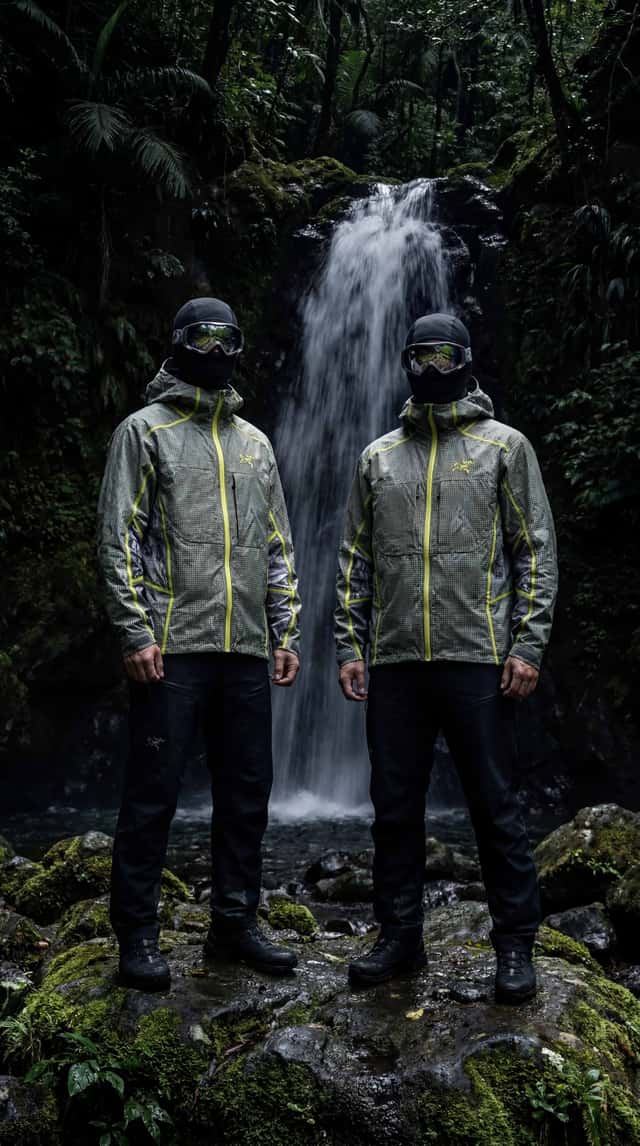
Step 2 — Creating the First Cinematic World
Before designing the product details, we needed to define the world around the jacket.
The first direction focused on a dark waterfall environment.
This helped establish the campaign’s mood: wet rocks, deep shadows, reflective goggles, balaclavas, moss, and technical gear.
Ready-to-copy prompt
This was the atmosphere anchor.
It gave the project a darker, expedition-like feeling and made the clothing feel like equipment rather than styling.
The waterfall setting also helped introduce one of the most important themes of the concept:
The jacket is not just worn in nature.
It is shaped by nature.
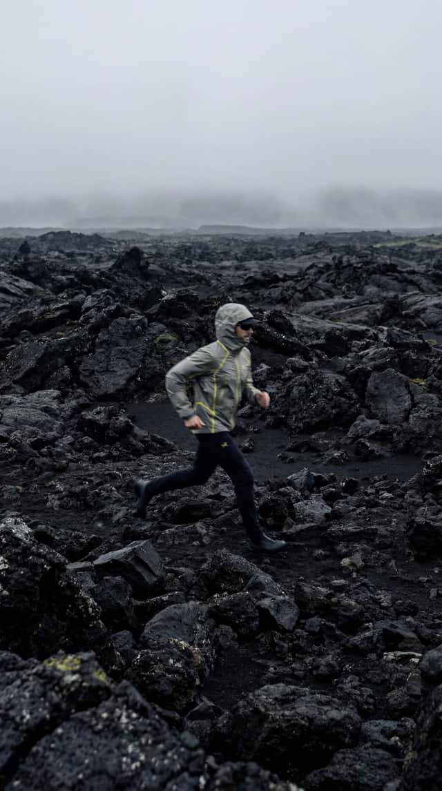
Step 3 — Building the Volcanic Landscape Direction
The next direction moved the concept into a rugged volcanic environment.
This was important because volcanic terrain gave the visuals a more graphic and minimal foundation: black rocks, mist, desaturated colors, and strong contrast.
Ready-to-copy prompt
This frame helped define the campaign’s more editorial side.
The motion blur made the person feel like they were moving through the environment, not posing inside it.
That matters for this type of workflow because outdoor product concepts can quickly become too static.
The volcanic landscape made the jacket feel active, weather-ready, and connected to real terrain.

Step 4 — Designing the Editorial Jacket Frame in Nano Banana
Once the world was clear, we moved into the jacket itself.
The first product prompt focused on a high-tech editorial image: waterproof fabric, muted earth tones, technical overlays, and a futuristic outdoor silhouette.
Ready-to-copy prompt
This step created the first clear bridge between fashion and field documentation.
The important part was the overlay.
Instead of making the jacket feel purely decorative, the technical diagrams suggested function: weather data, coordinates, product specs, and expedition mapping.
That became one of the central design principles of the concept:
**The graphics should feel like field data, not decoration.**
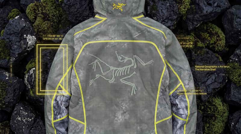
Step 5 — Creating “The Narrative Shell”
The strongest product direction came from the macro jacket prompts.
Here, the goal was to keep the jacket itself unchanged and add the National Geographic-inspired design language as an external graphic layer.
That distinction matters.
We didn’t want the yellow frame or typography to look printed onto the fabric.
We wanted it to feel like a campaign interface around the product.
Ready-to-copy prompt
High-tech editorial photography, macro shot of the jacket. Do not alter the jacket itself: keep the original jacket design, shape, color, seams, material, logos, pockets, sleeve construction, and all visible details exactly unchanged.
Add only a subtle overlay of technical typography and GPS coordinates as a graphic layer around the jacket, not directly on it. A minimalist glowing yellow rectangular frame appears as an external graphic element aligned near the sleeve, without changing or printing onto the fabric. National Geographic x Arc’teryx branding, “The Narrative Shell”, hyper-detailed fabric texture, 8k, clean editorial lighting, premium outdoor-tech aesthetic.
This became the core product image.
The phrase 2The Narrative Shell" gave the concept a product name, while the yellow frame gave it a clear visual connection to National Geographic.
But the most important prompt detail was this:
Do not alter the jacket itself.
That kind of constraint is useful when working with AI image tools because it tells the model what should stay stable and what should be treated as a graphic addition.
In this case, the jacket remains the product.
The overlays become the storytelling system.
Step 6 — Refining the Graphic Overlay System
After the first macro direction, we tested a more direct version of the graphic overlay.
The idea was to combine close-up product texture with GPS data, technical typography, and a yellow rectangular frame.
Ready-to-copy prompt
This version was useful because it simplified the image.
Instead of building a full landscape, the prompt focused on the jacket as the campaign surface.
That helped create a more premium product-detail frame.
For this kind of workflow, those detail shots are essential because they make the concept feel more complete.
The wide shots establish the world.
The macro shots establish the product.
Step 7 — Creating the Motion Language: Breaking Out of the Frame
Once the product and world were defined, the next challenge was motion.
A National Geographic-inspired yellow frame is instantly recognizable as a visual device.
So we used it as more than a static graphic.
The idea: the person runs through the yellow frame and leaves the image behind.
Ready-to-copy prompt
This became the main campaign metaphor.
The frame represents documentation.
The runner represents movement beyond the image.
The jacket connects both worlds.
That’s why the line “Beyond the Image” works well here.
It turns the yellow rectangle from a branding reference into a story device.
Step 8 — Building the Black-and-White Running Sequence
The next motion direction pushed the campaign into a more abstract editorial space.
We used a black volcanic cinder field, high-contrast lighting, ghosted movement frames, and technical clothing frozen mid-air.
Ready-to-copy prompt
This sequence helped create visual energy without losing the technical tone.
The black-and-white treatment made the yellow frame direction feel even stronger by contrast.
It also gave the campaign a more experimental fashion-film feeling while staying connected to outdoor performance.
Step 9 — Creating Nature Texture Studies
To avoid making the campaign only about people wearing jackets, we created pure landscape and material studies.
These shots are useful because they can become transitions, backgrounds, campaign cutaways, or product texture references.
Volcanic texture prompt
This prompt created the natural texture language for the volcanic side of the campaign.
Black rock.
Green life.
Moisture.
Sharp contrast.
It works because it mirrors the product logic: hard technical protection meeting fragile natural detail.
Glacier-meets-fabric prompt
This was one of the strongest texture concepts.
It connects the jacket material directly to the environment.
Instead of saying waterproof, the image shows waterproof fabric becoming part of an icy landscape.
That’s a useful trick for AI campaign workflows:
Translate product features into visual metaphors.
Step 10 — Animating the Landscape Transitions
With the stills working, we moved into cinematic transitions.
The first transition focused on a frozen lake morphing into mountain topography.
Ready-to-copy prompt
This type of transition is useful because it doesn’t rely on a person or product.
It gives the edit breathing room and helps connect the campaign’s themes:
ice, mapping, terrain, documentation, and movement.
Glacial river flyover prompt
This shot expanded the scale of the campaign.
After all the macro fabric and jacket details, the drone-style landscape view makes the world feel much larger.
It also gives the concept a more documentary-like rhythm.
Step 11 — Creating the Final Fashion Film Layer
The last part of the workflow focused on wearable motion.
We wanted one clean studio-style sequence where the jacket becomes the center of attention without needing a dramatic landscape.
Ready-to-copy prompt
This clip helped bring the campaign back to the product.
The landscapes build the world.
The running sequence builds momentum.
The studio shot shows the jacket clearly.
That balance is important for AI spec workflows.
If every image is too atmospheric, the product gets lost.
If every image is too product-focused, the world feels thin.
The final workflow needed both.
Step 12 — Putting the Campaign Together
By the end, the concept had a clear visual system:
- A product idea: The Narrative Shell
- A brand-world tension: outdoor performance meets field documentation
- A graphic device: the yellow National Geographic-style frame
- A landscape language: volcanic rock, glacial rivers, ice, moss, waterfalls
- A motion idea: breaking out of the frame and moving beyond the image
The strongest part of the workflow was not one single prompt.
It was the way the prompts built on each other.
First, we created the world.
Then, we defined the jacket.
Then, we added the graphic layer.
Then, we translated the campaign into motion.
That’s what makes AI workflows more useful.
Not just generating one nice image.
But building a repeatable system that can become a campaign direction.