What if Drake got his own frozen AP Swatch?: How we created an Iceman-inspired AI watch concept using GPT Image 2 and Seedance 2.0
A step-by-step breakdown of designing a fictional frozen AP Swatch Iceman concept, from translucent icy resin and skeleton dial details to cinematic product videos — prompts included.

You know the struggle.
You want to stay up to date, but the amount of information around AI tools, workflows, and what works best is overwhelming.
Every week there’s a new tool. Every day a new workflow.
And it’s hard to tell what’s actually useful.
That’s exactly why we’re doing this series.
Instead of theory, we break things down into practical, replicable workflows — using fictional spec concepts to show what’s possible, and how to actually get there.
For this week’s breakdown, we wanted to build something that feels like a luxury watch drop frozen inside internet culture.
The idea started with one simple question:
What if Drake got the AP Swatch he deserved for Iceman?
Because a fictional Iceman watch shouldn’t just be a blue watch with a name attached.
It should feel frozen. Transparent. Expensive.
Like someone locked a skeleton dial, an icy resin case, and the OVO owl inside a block of glass.
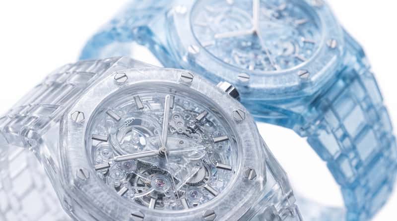
So we took the visual language of a Royal Oak-style octagonal case, pushed it through a Swatch-like material world, and turned it into a frozen translucent concept watch.
The result:
Royal Swatch Iceman.
A fictional icy watch concept with:
- translucent icy resin
- a frosted octagonal bezel
- a fully transparent skeleton dial
- silver hands and indices
- glacial blue material details
- and the OVO owl frozen in the center like a diamond locked in glass
For this workflow, we used:
- GPT Image 2 for product, editorial, and key visual image generation
- Seedance 2.0 for cinematic product and fashion video animation
Not a reader? Check out the interactive workflow at the end of the post.
Now, let’s get into it.
Step 1 — Defining the Core Watch Concept
Everything started with the material idea.
The goal was not to create a normal watch and simply make it blue.
The goal was to make the entire object feel like it had been carved from ice.
That meant thinking in layers:
- The case should feel like translucent frozen resin
- The bezel should feel frosted, sharp, and architectural
- The dial should be skeletonized and almost invisible
The most important visual rule was this:
The watch should not look painted.
It should look frozen from the inside out.
So we built the concept around crystalline textures, refractive lighting, macro photography, white studio backgrounds, and a cold luxury atmosphere.
Step 2 — Creating the Clear Iceman Watch in GPT Image 2
The first still focused on the clearest version of the watch.
This was the base design: a transparent resin case, skeletonized inner mechanics, silver hands, and an ultra-clean studio setup.
The key was to make the watch feel physically believable.
Not just “transparent.”
Not just “icy.”
But like an actual object with thickness, refraction, shadows, gears, and material depth.
Ready-to-copy prompt
This became the foundation for the rest of the workflow.
Once the clear version worked, we could use it as a reference for product scenes, wrist shots, and video prompts.
Step 3 — Creating the Glacial Blue Edition
The next step was to create a colder, more distinctive colorway.
The clear version gave us the material logic.
The blue version gave us the Iceman identity.
We pushed the case into pale azure translucent resin and gave the bezel a stronger frosted texture, while keeping the inner mechanics transparent.
Ready-to-copy prompt
This version became the more recognizable hero colorway.
It instantly made the concept feel less like a generic transparent watch and more like a specific fictional product drop.
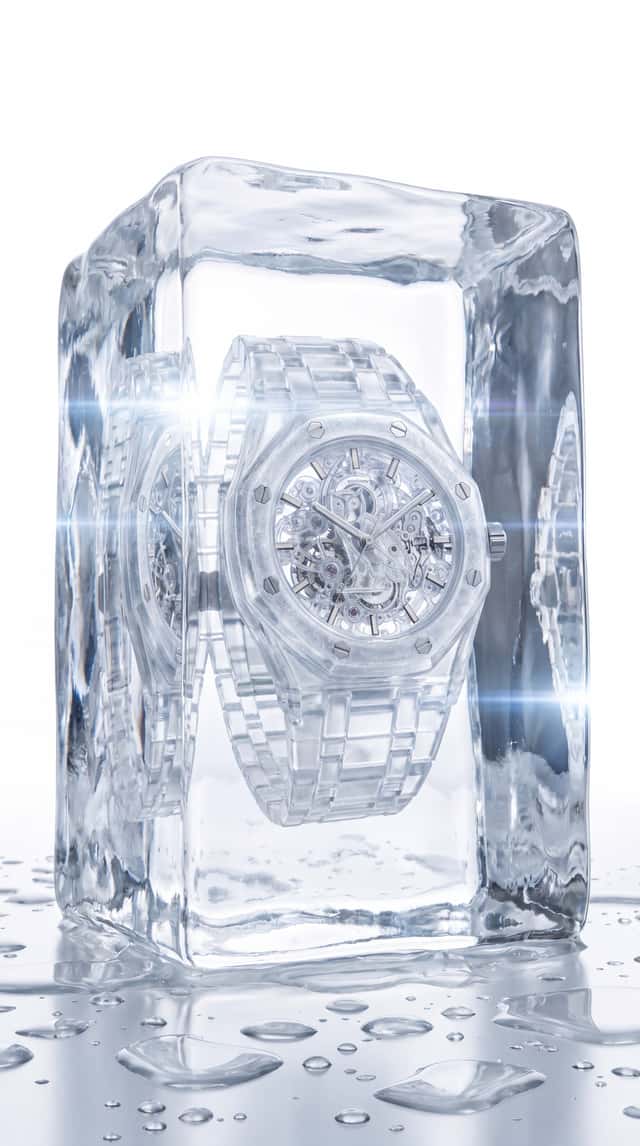
Step 4 — Freezing the Watch Inside Ice
Once the watch design existed, we wanted to create a stronger campaign image.
So we placed the watch inside a massive block of crystal-clear ice.
This helped sell the “Iceman” idea instantly.
It also gave the AI more material to work with: refractions, water droplets, distorted light, and frozen surfaces.
Ready-to-copy prompt
This shot works because it does not need a lot of explanation.
You immediately understand the product world:
a frozen watch, locked inside ice, treated like a precious object.
Step 5 — Creating the Two-Watch Product Hero Shot
After creating both the clear and blue versions, we needed a product frame that showed the collection logic.
The best way to do that was with a two-watch macro setup.
One watch sits in sharp focus in the foreground.
The second sits slightly behind it, higher, softer, and out of focus.
This creates depth and makes the image feel more like a premium watch campaign.
Ready-to-copy prompt
This frame helped make the concept feel more complete.
Instead of one standalone object, it starts to feel like a drop:
clear edition, glacial blue edition, same icy design system.
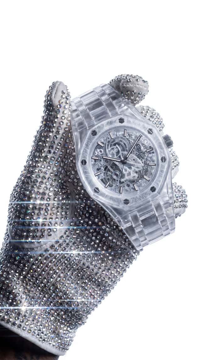
Step 6 — Creating the Wrist Shot
A watch concept only becomes believable when you see it on the wrist.
So the next step was to create a clean wrist-focused shot with a strong hand pose, white background, and luxury streetwear energy.
The challenge here was keeping the watch readable.
AI often loses detail when the product gets smaller in frame, so the prompt had to repeat the most important design details: translucent icy resin, transparent skeleton movement, frosted bezel, and clear frozen feel.
Ready-to-copy prompt
This gave the concept a more human scale.
The product shots make it desirable.
The wrist shot makes it feel wearable.
Step 7 — Building the Fashion Editorial World
The concept also needed a character.
Since the reel positions the watch around Drake’s Iceman era, the visual world needed to feel cold, expensive, and music-culture adjacent without becoming too literal.
So we created a fashion editorial character:
short bleached hair, black minimalist coat, silver jewelry, and a jeweler’s loupe.
The idea was simple:
Someone is inspecting the ice like a diamond.
Ready-to-copy prompt
This image helped connect the product world to a campaign world.
The watch is not just sitting in a product render anymore.
It belongs to a cold, polished, fashion-led universe.
Step 8 — Animating the Concept in Seedance 2.0
Once the stills were working, we moved into video.
The goal was not to overcomplicate the motion.
For this kind of product concept, small camera moves and material details are often enough.
We focused on:
- slow zooms
- macro rack focus
- crystal refractions
- light gliding over frosted bezels
- subtle hand movement
- shimmering diamonds and ice textures
Fashion character video prompt
This clip works as a mood-setter.
It gives the concept a person, a styling direction, and a visual attitude before cutting into the product details.
Diamond glove wrist video prompt
This gave us the most “Iceman” movement.
Diamonds, translucent watch case, white studio, slow motion, and light refractions all work together in one simple frame.
Two-watch macro video prompt
This clip is useful because it turns the two-watch still into a proper product ad moment.
The rack focus does most of the work.
It lets the viewer discover the second colorway instead of showing everything at once.
Ice inspection video prompt
This became one of the strongest campaign-style motion shots.
It makes the ice feel precious.
And once the ice feels precious, the watch inside it feels more valuable too.
Interactive Node Workflow
If you run this workflow yourself, you’ll quickly see where each tool is strong — and where it starts to break.
That’s the point of this series.
Not just showing what’s possible, but helping you decide what’s actually worth using.
If this was useful, you’ll like FAST FORWARD.
- emerging creative workflows and AI news It’s our weekly signal on:
- standout AI + CGI work
- ideas you can actually apply
No noise. Just things worth paying attention to.