Depuis quand les patchs anti-boutons sont-ils aussi bons ? : Comment nous avons créé une pub spec IA TirTir x Murakami avec NanoBanana Pro et Kling 3.0
Un décryptage étape par étape de la conception d'une collaboration beauty fictive TirTir x Murakami, de sa génération par IA et de son animation en pub spec — prompts inclus.
Tu veux rester à jour, mais la quantité d’informations sur les outils IA, les workflows et ce qui fonctionne le mieux est écrasante.
Chaque semaine, un nouvel outil. Chaque jour, un nouveau workflow.
Et il est difficile de savoir ce qui est vraiment utile. C’est exactement pour ça qu’on fait cette série.
Plutôt que de la théorie, on décompose les choses en workflows pratiques et reproductibles — en utilisant des pubs spec fictives pour montrer ce qui est possible, et comment y arriver concrètement.
Pour le décryptage de cette semaine, on voulait construire quelque chose qui se situe exactement à l’intersection de la beauté, de l’art et de la culture produit.
L’idée a commencé par une question simple :
Depuis quand les patchs anti-boutons sont-ils aussi bons ?
Parce que ce lancement fictif TirTir x Murakami ne ressemble plus à de la skincare au sens traditionnel du terme.
Ça ressemble davantage à quelque chose entre un produit de beauté et de l’art portable.
On a donc voulu voir à quoi ressemblerait cette idée sous forme de campagne complète.
Étape 1 — Concevoir le produit de base dans NanoBanana Pro
Tout a commencé par le système produit.
Plutôt que de générer une photo beauty aléatoire, l’objectif était de créer quelque chose qui ressemble à une vraie collaboration en édition limitée :
des sachets en feuille d’argent
des fleurs et des yeux dans le style Murakami
un look de produit K-beauty premium
un langage de design extensible à d’autres assets de campagne par la suite
La première image s’est concentrée sur le packaging lui-même.
Voici le prompt prêt à copier :
Prompt
A professional flat-lay beauty product photograph of multiple rectangular ultra-thin silver chrome foil pimple patch sachets scattered and overlapping, shot from above. Pure white background. White “TIRTIR” lettering centered on each sachet. Each sachet has many small Murakami-style motifs — flowers and eyes — that are SMALL, maximum 1.5cm, scattered like stickers all over the sachet surface, not centered, not large, not dominant. The motifs are tiny decorative elements, never bigger than 1/6 of the sachet width. Every single sachet has a MIX of multiple different flower colors — rainbow, pink, blue, yellow, red, purple all appearing together on the same sachet — never one single color per sachet. The eyes also vary in color across the sachet, some green iris, some blue, some purple. Thick black outlines. Flat silver chrome foil background on each sachet. Soft diffused studio lighting. K-beauty editorial flat-lay. 8K ultra-realistic beauty photography.
Cette image est devenue la base de toute la direction visuelle.
Étape 2 — Créer les photos hero du produit
Une fois la direction packaging définie, l’étape suivante était de construire les visuels hero du produit.
Cela comprenait :
la feuille de patchs anti-boutons elle-même
l’extension cushion compact
des gros plans luxueux qui donnent à la collaboration fictive un aspect plus complet
Prompt prêt à copier
Prompt
High-end product photography of a white minimalist tray holding exactly 12 hydrocolloid pimple patches in a 4x3 grid, perfectly following the layout of Image 4. REMOVE all Louis Vuitton logos and symbols. Replace the five LV-branded patches with iconic Takashi Murakami designs: include the blue “Mr. DOB” character with large ears (from Image 2), the colorful “Jellyfish Eyes” with long lashes (from Image 1), and the stylized winking eyes (from Image 3). The other 7 patches remain as vibrant, smiling Murakami flowers in various rainbow and solid colors. The patches are a mix of circular transparent stickers and custom die-cut shapes that follow the silhouette of the characters and flowers. Clean studio lighting, seamless white background, 8k resolution, sharp focus, professional skincare aesthetic.
Prompt d’extension produit supplémentaire
Prompt
Use reference image 1 for the exact red Murakami TIRTIR design, artwork, colors, logo, glossy finish, and all surface details. But the compact itself must have the exact same fully closed outer shell shape, proportions, silhouette, and front view as reference image 2. It should look like one smooth, sealed oval compact from the outside only, just like the silver version. No visible opening, no lid separation, no gap, no inner tray, no exposed interior. The Murakami artwork must be applied onto the closed outer shell, while preserving the exact clean closed form of reference image 2. Centered front-facing studio product shot, isolated on light gray background, hyper-realistic, luxury beauty product photography.
Et pour une touche encore plus premium :
Prompt
Professional studio shot of the TIRTIR Red Cushion Foundation. The metallic red surface of the lid features deep engravings of Takashi Murakami’s smiling flowers and surrealist characters reference image 2 and 3. Inside the engraved lines, vibrant multi-colored enamel fills are applied, contrasting against the deep red metallic finish. 3D depth, high gloss, ultra-detailed, 8k, commercial product photography, soft reflections, white background.
Étape 3 — Construire les frames de campagne
Une fois le produit de base établi, on l’a décliné en différents visuels style campagne.
L’idée était d’éviter que tout ressemble au même rendu studio.
On a donc poussé le concept dans quelques univers différents :
editorial luxe sombre
setups produit futuristes
gros plans beauté réalistes sur la peau
Cette diversité rend la campagne fictive beaucoup plus complète.
Prompt prêt à copier
Prompt
Authentic high-end luxury editorial photography, shot on Hasselblad, 8k resolution. A perfectly composed shot of the TIRTIR Murakami Edition.
The Exact Product & Proportion (Crucial):
The silver foil sachet is the base object, tilted diagonally. Layered directly on top is the transparent pimple-patch sheet. The size of the patch sheet must be a perfect fit: it should cover approximately 90% of the sachet’s surface, meaning it is slightly smaller than the packaging but fills it almost completely, leaving only a thin silver border of the sachet visible around the edges.
The Design (Zero Variation):
The pimple-patch sheet must be an exact replicate of the reference image, featuring the specific arrangement of multicolored Murakami smiling flowers and stylistic eyes. No new characters, no rearranged stickers. The silver sachet must also feature the exact same rainbow flowers and the crisp white TIRTIR MURAKAMI EDITION logo.
Lighting & Atmosphere (Balenciaga Style):
A deep, cold midnight-blue and obsidian black void. The scene is lit by a sharp, focused beam of cool white light from above, creating a high-contrast, moody gradient on a polished black obsidian mirror floor. Harsh chiaroscuro lighting with extreme contrast. The transparent plastic of the sheet must have realistic light refraction and crystalline edges with sharp white specular highlights.
Composition:
Asymmetric, avant-garde, and mysterious. Extreme high contrast, shallow depth of field, raw cinematic grain, photorealistic, minimal and sophisticated.
Negative Prompt:
(Patch sheet too small, patch sheet too large, rearranged stickers, different design, 3D render, CGI, digital art, symmetric, centered, soft lighting, gray background, white background, cartoonish, plastic look, fake reflections, generic product shot, warm tones, yellow light).
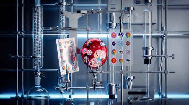
Prompt setup futuriste
Prompt
Using the first image as the scene, lighting, and composition reference, remove the gray time-line Cellular Energy Le Sérum bottle. In its place, display the TIRTIR Red Cushion Foundation: The primary center piece, held securely by a metallic laboratory clamp. Its metallic ruby red lid features a mix of colorless laser-engraved Murakami flowers and vibrant, colorful surrealist characters, with the crisp white logo TIRTIR MURAKAMI EDITION prominently visible. Silver Foil Sachet: Held upright by another chrome clamp, slightly tilted toward the camera. It is printed with Takashi Murakami’s rainbow smiling flowers, colorful eye motifs, and the TIRTIR MURAKAMI EDITION logo. Pimple-Patch Sheet: The transparent hydrocolloid sheet with colorful Murakami stickers is no longer floating; it is firmly held by a small, precise metallic laboratory clip attached to a horizontal chrome rod, making it look physically integrated into the grid. It casts a soft, realistic shadow on the background. Lighting & Style: Change the entire image to a futuristic aesthetic while preserving the product details. Cool blue color cast throughout, high contrast, sterile futuristic lighting, clinical atmosphere, technology-forward, cold metallic feel. The environment shifts from monochrome gray and silver to sleek chrome and steel, with the metallic red of the cushion and the vivid Murakami artwork still popping intensely against the cool futuristic setting. Crisp editorial product lighting with a polished laboratory-tech mood, ultra-sharp focus on the products, shallow depth of field, photorealistic, 8k resolution, 4:5 vertical format, clean and minimal. High contrast with slightly crushed shadows, luminous cool highlights, subtle futuristic reflections, fine but visible film grain texture, extreme sharpness. Negative Prompt: floating objects, flying stickers, no serum bottle, no dropper, no text overlays, no extra props, no warm tones, no cluttered background, no distorted logos.
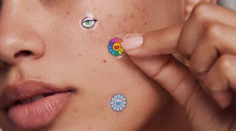
Prompt beauté sur la peau
Prompt
Recreate the reference image exactly, keeping the same composition, framing, lighting, and mood, but replace the translucent pink heart-shaped pimple patches with TIRTIR Murakami Edition hydrocolloid patches reference the exact pimple patches . The patches must be clearly smaller discreet, and proportionate to real blemishes, not decorative sticker-sized. Use small clear circular patches reference image 2 Takashi Murakami rainbow smiling flowers and cartoon eye designs.
Apply a Kodak Portra 400 film look: soft pastel palette, muted tones, creamy skin rendering, subtle warmth, authentic film grain, lifted shadows, gentle highlight rolloff, natural daylight balance, slightly desaturated greens and blues.
Ultra close-up macro shot of a woman’s cheek, mouth corner, and fingers. Hyper-realistic skin with visible natural texture: pores, fine peach fuzz, subtle freckles, small blemishes, light acne marks, tiny moles, and a natural oil sheen. No retouching, no smoothing, no plastic skin. Warm neutral skin tone, soft natural lipstick on the lower lip visible in the lower-left corner.
A hand enters from the right with a manicured nude or soft-pink nail, fingertip gently pressing one very small Murakami patch onto the cheek. Soft diffused daylight from the left, gentle shadows, shallow depth of field, sharp focus on the patch being applied.
Patch placement:
Upper-left cheek: very small transparent circular patch with a rainbow Murakami smiling flower.
Center being applied by fingertip: very small transparent circular patch with a Murakami cartoon eye design with long lashes and colorful iris.
Lower cheek near the mouth: very small transparent circular patch with a pastel blue or pink Murakami flower.
The patches should look like real hydrocolloid: slightly glossy, ultra-thin, semi-transparent edges blending into the skin, Murakami artwork printed crisply on top, sitting flush on the skin with a subtle shadow underneath. Scale all patches down significantly so they feel tiny, refined, and realistic, around the size of true acne spot patches, about 30–40% smaller than typical decorative beauty stickers.
Photorealistic editorial beauty photography, skincare campaign aesthetic, sharp high detail, Kodak Portra 400 softness and creamy tonal response.
Negative: no heart shapes, no pink translucent patches, no oversized patches, no large sticker-like patches, no airbrushed or plastic skin, no over-retouching, no text, no logos on skin.
Étape 4 — Animer dans Kling 3.0
Les stills étant prêts, on est passé à Kling 3.0.
L’objectif ici n’était pas de trop compliquer le mouvement.
Les pubs beauty bénéficient généralement de mouvements petits et contrôlés :
zooms lents
révélations propres du produit
mouvements de caméra subtils
comportement réaliste des matériaux
Prompts prêts à copier
Prompt
slow zoom in
Prompt
cinematic zoom-out, natural movement
Prompt
slow zoom in, natural movements
Pour la révélation du compact :
Prompt
Luxury beauty product film of the exact referenced red TIRTIR cushion compact with Murakami-inspired artwork. The compact starts fully closed, standing upright and front-facing. Then the lid slowly flips open smoothly on its bottom hinge, revealing the cushion foundation inside. Keep the exact same product design, shape, glossy red material, logo placement, artwork, proportions, and camera angle as the reference images. No redesign, no deformation, no extra elements. Soft premium studio lighting, realistic reflections, precise hinge motion, elegant controlled opening, high-end skincare campaign aesthetic, hyper-realistic. Static camera, only the compact moves.
Et pour les étapes suivantes, la couche beauté humaine, tu dois passer à Cinema Studio Video :
Prompt
Create a video sequence studying a woman in a close-up, zoomed-in framing, with natural movement and realistic skin, using a cinematic focus pull effect where the focal plane smoothly shifts between foreground and background to direct attention, graded in a documentary natural style with neutral accurate colors, minimal stylization, realistic skin tones, true-to-life representation, and journalistic integrity with no artificial look.
Workflow de nœuds interactif
Si c’était utile, tu vas aimer FAST FORWARD.
C’est notre signal hebdomadaire sur :
les workflows créatifs émergents et les actualités IA
les travaux IA + CGI remarquables
des idées que tu peux vraiment appliquer
Pas de bruit. Juste des choses qui méritent attention.