Buxton Brewery - Can series

Emily RedfearnAvailable for work

I illustrated a set of beer can designs for Buxton Brewery - Lemon Slayed, Green Acre & Wakin’ Snakes.
It was a blast to collaborate my illustrated world within Buxton’s signature cans with their white swipe at the top. Each of the cans includes subtle inclusions of the Buxton Brewery logo within the illustrations (see if you can spot them!) which all followed themes inspired by their flavours and where they originated.
Green Acre is a West Coast IPA collaboration beer between Buxton Brewery & Rooster’s Brewing Co. which was inspired by American Indian pale ales, reflected in its citrus orange & grapefruit & woody pine flavours. They wanted to represent the friendship of this collaboration through the characters in the scene which I brought to life through grapefruit and orange characters walking down the orange peel road. American road trips heavily inspired the feel of this can with the pine forest and rolling hills in the distance. American park signage also influenced the direction of typography we went for. We also wanted a nod to the locations of both breweries which are signposted on either side of the can in-between the pine trees, with the back of the label edged in a pine-tree inspired border pattern.


Credits
Brand:
Also from Emily Redfearn
View all from Emily Redfearn →



Related Work
Browse All
Wall's Freezer Launches Ice Cream
Coca-Cola Girl With A Pearl Earring Reaches Out
 Coca-Cola
Smirnoff Bottle Emerges Twists from Floating Screen
Toblerone Package Emerges Through Mailbox

Puck Mr. Monopoly Spins Out Cream Cheese Bottle

Red Bull Can Weaves Through Colorful Balloons
 Red Bull
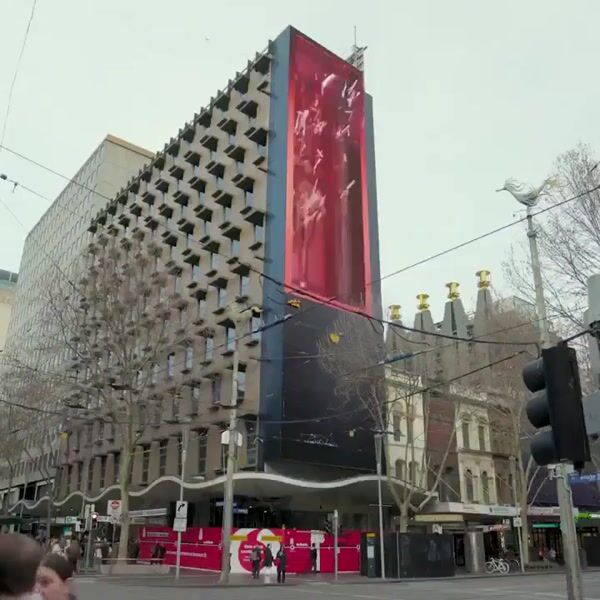
The Glenlivet Bottle Revealed on Silver Tray
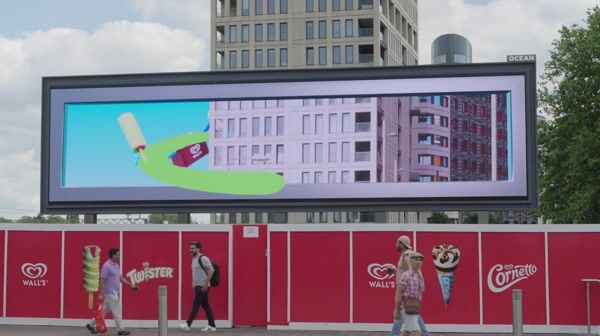
Wall's Cornetto and Twister Pop Out

Pepsi Bottle Fills Glass with Soda
 Pepsi
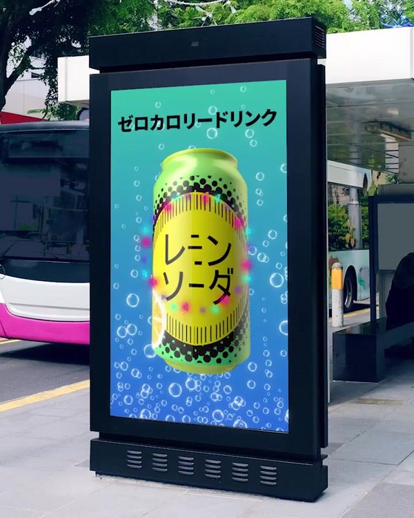
Remin Soda Cans Fill Up the Screen
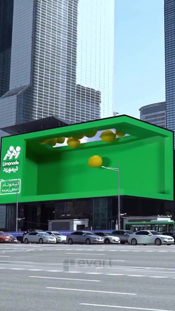
Zamzam Bottles Twist and Splash
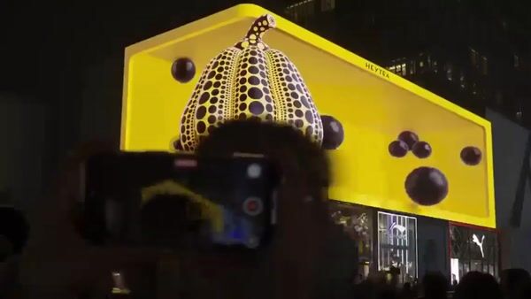
HEYTEA Boba Pearls Fill the Screen